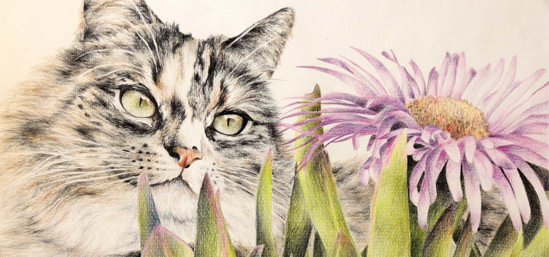
Tabby Cat Artwork: Original Drawing
When a mother recently lost her cherished tabby cat, Mack, her daughter reached out with a heartfelt request: a tabby cat artwork that would capture Mack’s unique spirit and provide a lasting memory.
Losing a beloved pet is like losing a member of the family. The grief can be profound, and finding ways to remember them becomes incredibly important.
This article details the process of creating that portrait – a colour pencil drawing of Mack, commissioned as a special gift of remembrance, and a testament to the enduring bond between us and our animal companions.
Memorial Tabby Cat Artwork
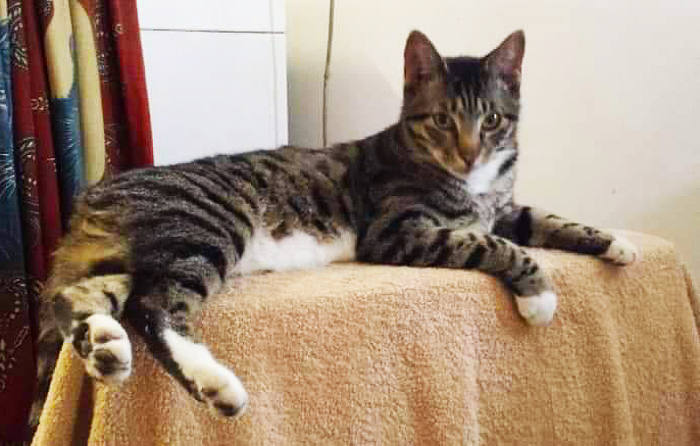
The memorial cat art of Mack was interesting, as the angle of the photo meant that the back paws were larger in perspective.
Add the fact that all the paws were hanging over the edge of the table, all at different angles.
I was also keen to keep the tabletop very simple so as not to detract from Mack but rather enhance the interest of the paw placements in the foreground of the drawing.
I do not usually do full pet portraits, so this commission was going to be a more challenging drawing for me. I was going to have to make sure that the paws were well drawn and looked natural for the artwork to look correct and true to life.
So, time to put pencil to paper! Let’s start the commissioned pet portrait description.
Art Materials I Used
I always state that the quality of your materials goes a long way to creating a polished-looking artwork.
Not only that, it is so much easier to work with good art materials. They do not have to be top of the range. But choose well-known brands that have a history of quality behind them.
The colours are better and the leads softer and easier to work with, and, in this case, quality paper makes it easier to correct mistakes. You won’t get holes in the paper from rubbing out or get creases you cannot get rid of.
All these damaging aspects contribute to an artwork not looking as good as it should, even if the drawing itself is of a good standard.
On that note, here are the materials I used.
The pastel paper has a fine texture that I like and is the well-known brand Winsor & Newton “Tints” range.
The colour pencils were Derwent; I have a couple of colour pencil set boxes in order to achieve the number of colour pencil variations I like to use. I have my favourite colours that I end up using all the time and am comfortable with.
Tabby Cat Artwork: Drawing In Colour Pencil
The very first tickbox before starting was to choose the colour of the paper.
This was pretty simple, as the original photo that I was working from had a lot of creams and beiges. So I chose a colour that would complement the warmer colours featured in some areas of the drawing – a warm beige pastel paper.
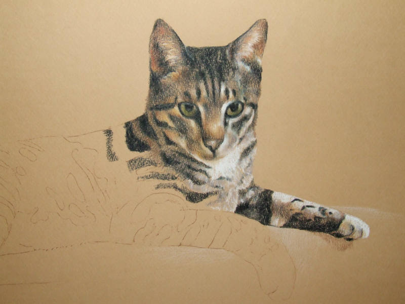
That done, I begin with my usual starting place for customised cat art – the eyes. I then work my way down the drawing to the back paws and tail.
The very last thing will be the fabric draped over the table – this is not my favourite subject matter, I have to say. Fabric folds can look very odd if not done correctly. But that is a long way off at this point, so let’s start at the beginning.
Where I Start: Tabby Cat Face
Sharpen the pencils that you will be using. It’s very important. Then start shaping the eyes.
I always start with the black outlines and fill and shape the eyes, making sure to capture the irises and highlights properly. They are the lightest and darkest aspects of the eyes with the most impact.
I take my time with the blending of the eye colour, making sure to create the roundness of the eyeball and get the shadows right. Once I am happy that I have done the best I can, I then start working around the eye, working outwards and upwards onto the face, eyebrows, forehead, and ears.
This is where the tabby markings start being created. It is important to follow the direction of the fur using the pencil strokes in the said direction. Also bear in mind the direction the light is coming from to create the shadows.
Body And Tail
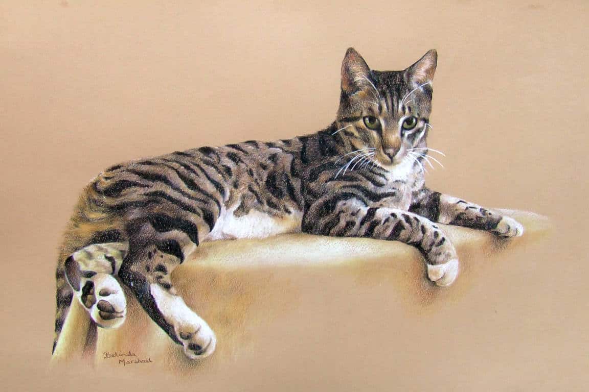
When I had completed the face and markings there, I then decided to work on the body of Mack and concentrate on the markings that are so prominent on a tabby.
I also took note of the very white areas of the chest and tummy and made sure those stood out as in the photo.
This was quite time-consuming. Within the black stripes, I try to create light and shadow too. This gives shape and nuances that make the black “stripes” look natural and gives movement to show the form of the cat. If you just did solid black stripes, it would look flat and uninteresting and detract from the beauty of the markings.
The same goes for the white and grey lighter areas. Within these are also highlights and shadows, which you can use to better advantage than the black markings. Here you can emphasise the colour nuances. I brought a touch of purple into the white areas to emphasize the shadows without using black. I think this added a more subtle range of colours to create depth where needed.
Legs and Paws
Now to the part of the drawing I considered the most important. The paws.
This is where the direction of the light was very important. The tops of the legs were highlighted in the reference photo, with the paws standing out dramatically and being white.
I took my time making sure I had the markings, shadows, and highlights right to make sure the paws and legs looked natural.
I also made note of the shadows under the paws. By making sure I had the darkness of the shadows in place, the paws popped and stood out nicely.
The trick to making these perspectives look right is to copy the photo reference closely. By thinking you can adapt or change one or more of the paws, you can make the other paws look wrong. You chose the photo for a reason; it looks right!! So don’t fiddle; you can save yourself a whole lot of bother down the line.
Table And Fabric Folds
The drawing was now almost complete, but floating in space!
This last bit to do is just as important as the cat; it gives a base to the drawing. But you don’t want to detract from the focus on the cat, so simplicity is required.
The highlight on the table could not be white to detract from the paws and tummy, so I chose a lighter version of the paper, a pale cream. I was careful to keep the circular shape of the table under the paws accurate and carefully added the darker areas of the hanging fabric to create a simple tabletop.
Under the back legs and paws, it was important to make that area darker in order to create movement of the eye around the drawing. Having the depth of colour at the bottom left and the highlights around the face draws your eye up and around the cat back down to the darker starting point.
View Another Colour Pencil Drawing: Cat Art from A Photo
The Whiskers
And do not forget the whiskers.
I make a point of writing about this. I often omit drawing these in until someone comments on the lack of them!
Mack’s whiskers were simple to do. They are not very visible in the photo, but I thought they would add more interest by making them stand out more.
Always make whiskers look natural. I loosen my wrist and just do an arc without being too particular. The natural movement doing it that way, I think, is more natural than a contrived line.
And that is that.
Tabby Cat Artwork Conclusion
My first love is drawing or painting cats, be they domestic or wild. Cats are so beautiful in their expressions, coats, and the way they move.
That is why I enjoyed creating this drawing of Mack. This tabby cat artwork is just so typical of cats relaxing, and I was pleased to have captured him so effectively.
There are many more articles I will be doing on pet portraits, and I hope you will keep coming back to see how I work and pick up some tips along the way if you are also an artist.
Otherwise, I hope you have enjoyed reading my tabby cat artwork article and hope you will visit my website again.